
Norsu Revamp

It's been almost four years since we opened the doors to this dream store of ours and, despite pouring all our love into her, she was starting to look a little tired. So this week we set about achieving the impossible in only four days — taking advantage of the grand final long weekend to completely transform the space from top to toe, with our amazing norsu team and our good mate Dave from Baytech Constructions and his crew.
Our vision for this space has always been to make it feel like a home: challenging the traditional retail setting by combining a shop aesthetic with a welcoming, home-like feel. From the get-go we wanted customers to feel like they're stepping inside our own homes as they walk through the separate living and bedroom zones — styled with our furniture and accessories, and finished with linen sheer curtains, spectacular artwork and feature pendant lighting.
When we began discussing the refresh with Lauren and Liz from our design team, we knew we had to keep that homely feel — and we couldn't be happier with how they've brought it to life. We've been flooded with questions about what we did, so let us step you through it.
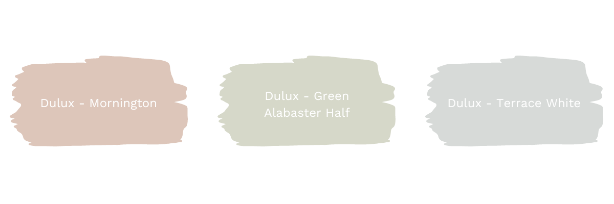
We've worked with Dulux since the beginning of our norsu journey. We love their colours, we know them inside out, and after painting five stores with them we know exactly which ones work for us. This time we selected our accent colours from the 2023 Colour Forecast 'Balance' palette — the fresh pastels Mornington and Green Alabaster Half feature predominantly, with classic Terrace White on the middle panelled wall.
For the panelled walls and ceilings we wanted a consistent story. After choosing Terrace White we selected two pairing colours from the same section of the grey colour wheel, and painted all three rooms in graduating depth as you walk through: Snow Season Quarter in the front room, Terrace White in the middle, Tranquil Retreat at the back. For the remaining walls, doors and skirting boards we used our go-to Vivid White — a crisp white that pairs with everything and never reads too cool or too warm.
We've gone all out with feature lighting — as in we've used almost every single pendant we sell. Sixteen individual feature lights, to be exact. Some may say OTT; we say the more the merrier.
Robert Gordon Interiors. We'd been waiting for the chance to install this range since we began selling it. The minute we saw them being individually handmade in the Pakenham factory we knew they were special, so we've made up for lost time in a big way — one of literally every light in their pendant and sconce range. The impact is undeniable.
Klaylife Calo pendants. Our best-selling Calo makes a big impact in the back living room. Handmade in Spain, and part of our collection for many years with good reason — we've clustered three in varying colours and sizes for maximum effect.
The Dancing Pendant by Menu. We knew instantly this statement piece needed a home in the makeover. Designed by Copenhagen duo Iskos-Berlin, it takes inspiration from a dancer's pleated skirt caught mid-twirl. Fun fact: it's made from ET felt, 100% recyclable and produced mainly from used bottles.
Eos feather pendant. Another norsu favourite that has been with us since the very beginning. Its soft nature gives a calm, dreamy feel to any space, and it works in both adult and children's rooms. This one has been in the store since the first renovation — we couldn't bear to say goodbye.
The furniture. It wouldn't be a norsu store without an abundance of GlobeWest and Ethnicraft pieces, plus our own bespoke bedheads and ottomans — all shoppable below.
The panelling. We find it hard to look past Easycraft VJ panels, and have used them in almost every store we've had. In the original fit-out we installed the VJ board on the ceiling, then cascaded it onto a feature wall in each room. The impact these inexpensive panels make is phenomenal. With the refresh we retained the panelling, replaced one water-damaged wall, and repainted in the new colours.
The flooring. The beauty of a neutral, timeless floor is that you never need to change it — exactly the case here. Our Godfrey Hirst boards are from the Oak Elegance collection in Coastal Oak, and they still pair beautifully with the new look.
The sheers. Some might say linen sheer curtains in a retail store is extravagant. We'd say absolutely not — the difference is transformational, and it's what makes the space feel like a real home. We teamed up with Warwick Fabrics and Matt from Sheridan Window Furnishings to install sheers from the Warwick Aesop range in Atlantic and Parchment.
Thank you so much for following along on this crazy journey. We're so thrilled with the outcome and can't wait to welcome you into the space very soon — 148 Burke Road, Malvern East.
